
Mar 20, 2025

Thomas Fraile - Creative Art Director & Designer
The Colour Onion System:
Introduction
The Colour Onion System (C.O.S.) is a flexible and dynamic framework created to help designers navigate the complexities of colour. It goes beyond personal preference—it’s not just about picking colours you like. It’s about understanding how colours function together, how they interact with their context, and how they contribute to cohesive, impactful design.
With C.O.S., you can learn, study, save, and reuse your colour schemes efficiently. It’s also built for sharing, making it easier to align colour strategies across teams or creative collaborators. Whether you’re working with brand guidelines or starting from scratch, C.O.S. provides a structured yet adaptable method for making colour decisions that are both intentional and expressive.

Design as a System, Built Like an Onion
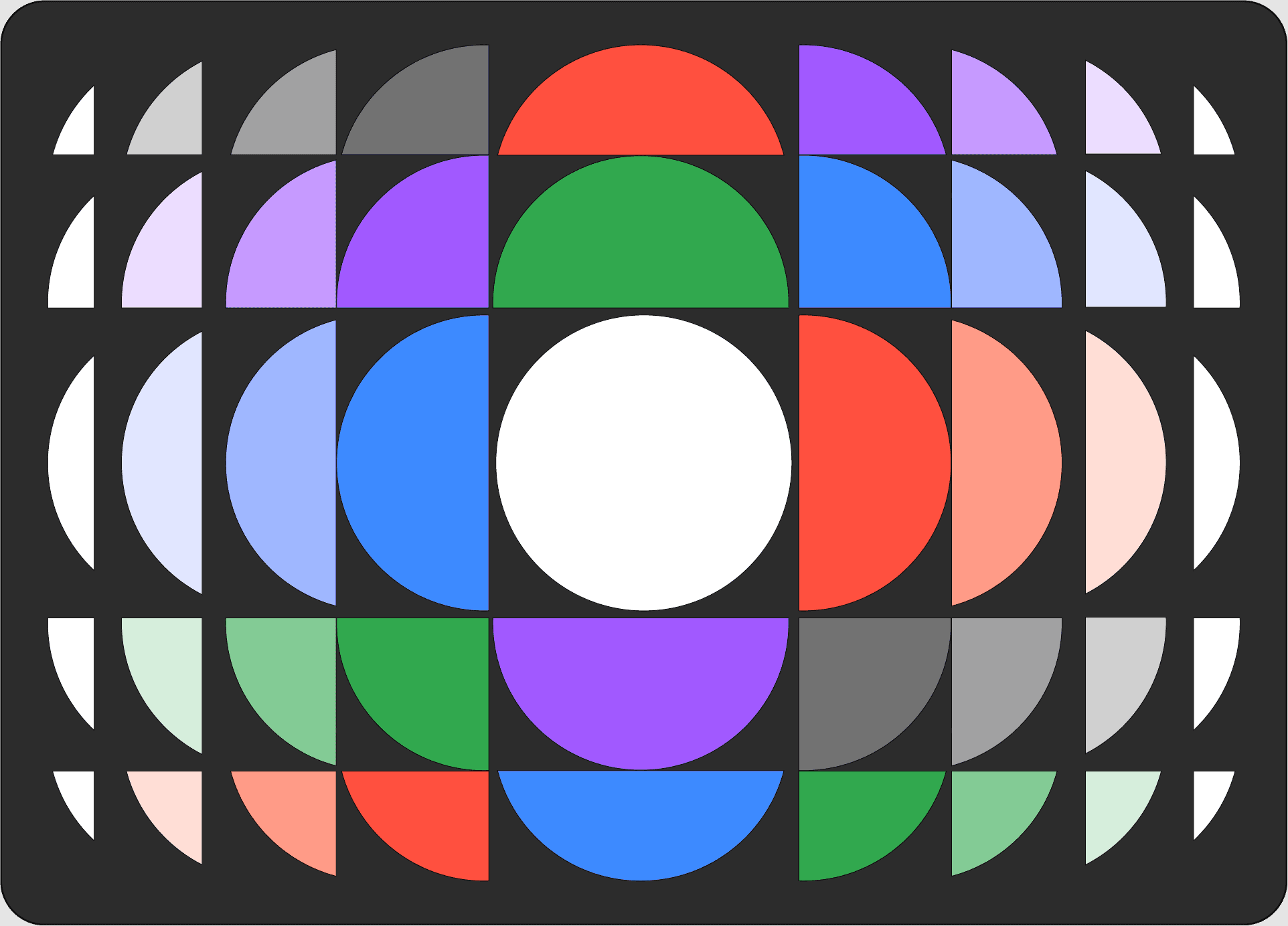
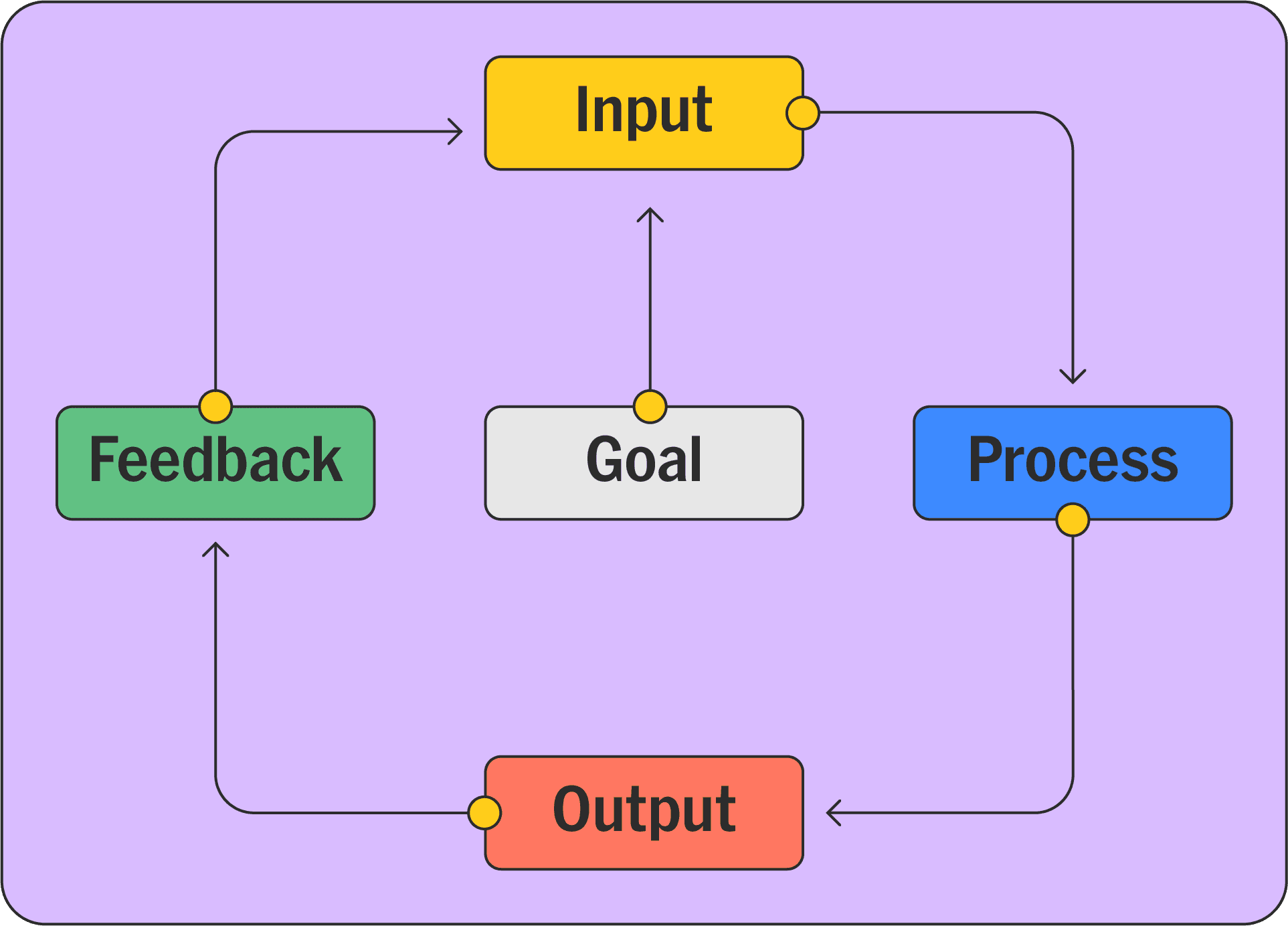
It’s called a system because it has structure: inputs, processes, outputs, and a feedback loop—all grounded in the Universal System Model. These are interconnected components, each one serving a specific function within a larger structure. And it’s called an onion because the system is built in layers—colours, styles, ratios, mediums, stakeholders, and designs—all of which interact in ways that may not be immediately visible but are crucial to the outcome.
These layers affect one another deeply, influencing the way a design feels, communicates, and performs. Like an onion, the design is built from the inside out. Every layer contributes to the structural integrity and emotional resonance of the final piece.
In other words, the Colour Onion System reflects the interconnectedness of design elements within a flexible, evolving design process.
The Structural Framework
The backbone of C.O.S. is based on the Universal System Model—a simple, clear framework that makes the process easy to follow and adaptable to different types of design work.
It includes five core stages:
Purpose or Goal – The guiding intention or direction of the project.
Input – The resources and elements that feed into the system (e.g. colour, medium, style).
Process – How the inputs are transformed through ratios, interactions, and style decisions.
Output – The final result or deliverable, shaped by both colour and context.
Feedback Loop – The ongoing refinement process driven by testing, feedback, and iteration.
This structure makes C.O.S. both practical and dynamic—something you can return to, evolve with, and scale across different projects and platforms.
Integrating C.O.S. Into the Workflow
The Colour Onion System fits naturally into a designer’s workflow. It mirrors how we think through a project—from vision to execution—while providing a structured approach to colour.
Using the Universal System Model as the foundation, we break the workflow into the following key components:
1. Purpose / Goal
Every design begins with a clear objective. The purpose of your project sets the tone for every decision that follows. It defines the emotion, message, or story that the design must communicate.
For example:
A design that needs energy might call for bold, vibrant colours.
A calming, trustworthy tone may require soft, muted tones.
In the Colour Onion System, the goal anchors the palette, style, and ratio choices, giving direction to the entire process.
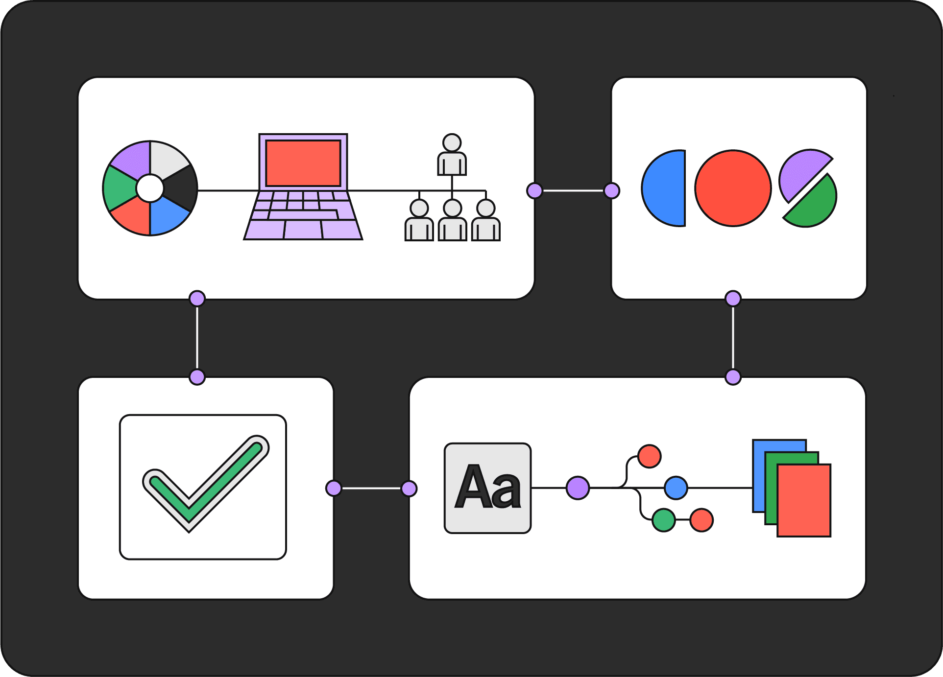
2. Input: Colour and Context
Inputs are the raw materials you feed into the system. These include:
Colours (brand colours or custom selections)
Design styles
The medium (digital, print, spatial)
Stakeholders (designers, clients, users)
Starting Point
Each design begins with selecting colours, forming the visual vocabulary of the project. These colour decisions, along with the placement of text and images, are influenced by the boundaries of the medium—such as the dimensions of the artboard or canvas—which in turn affect ratios, spacing, and overall composition.
Colour Strategy
Colour choices should be purposeful. Before selecting hues, consider:
What message or emotion do they need to convey?
What hierarchy do they need to support?
You can structure your palette using a colour hierarchy:
Primary Colours: The dominant hues that define the core tone.
Secondary Colours: Supportive accents that add depth and contrast.
Tertiary Colours: Complementary shades that introduce flexibility and nuance.
These colour categories also directly inform style development later in the process.

3. Process: Style, Ratio
and Interaction
Once your colours are chosen, the process phase defines how they will interact. This includes establishing style rules, determining ratios, and adjusting for context like medium and space.
Style Definition
Styles translate your colour palette into visual expression. They determine how colours work together and how much structure or freedom is applied. Style layers align directly with the colour hierarchy:
Primary Style: Built around primary colours; sets the dominant tone and visual identity.
Secondary Style: Integrates both primary and secondary colours; adds range and complexity.
Tertiary Style: Incorporates all three colour levels for more nuanced or flexible design approaches.
For more advanced or modular systems—such as in UI/UX or branding—you can expand with:
Default Style: The main structure, aligned with the core design system.
Auxiliary Style: An alternative, often used to invert or break from the default for emphasis or creative variation.

Ratio Process
The ratio component governs how much space each colour occupies in the composition. It brings balance, guides attention, and reinforces hierarchy.
Harmonic Balance: Ratios help ensure no single colour overpowers unless strategically intended.
Strategic Proportions: Careful distribution of colours contributes to unity and clarity.
Visual Rhythm: Ratio allows designers to create tension or calm through contrast in scale and saturation.
C.O.S. treats ratios as more than visual metrics—they reflect a deeper interplay between passive and active attention. By controlling ratios, designers guide the viewer’s eye and orchestrate the experience of the design.
Also consider the dimensions of your artboard or canvas, as these affect how ratios play out in space. The area available influences colour balance, placement of elements, and visual rhythm across your layout.

4. Output & Medium Consideration
The output is more than a visual file—it’s the realization of all your colour choices, styles, and ratios, shaped by the medium in which the design lives.
Final Realization: The final product reflects not only your palette and design decisions, but also how it translates in different formats—digital, print, spatial, etc.
Medium Impact: Colours behave differently across mediums. What works on screen may shift in tone when printed or displayed in a physical environment.
💡 Also consider the dimensions of your artboard or canvas, as these affect how ratios play out in space. The area available influences colour balance, placement of elements, and visual rhythm across your layout.
Factoring in the medium and scale early in the process helps you avoid last-minute surprises and ensures colour harmony carries through to the final result.
5. Feedback Loop: Iteration and Refinement
C.O.S. is not a linear process. It functions as a loop—a dynamic workflow where input, style, and ratios evolve through reflection and collaboration.
Refinement: Stakeholder feedback or user testing may prompt adjustments to your colours, proportions, or style rules.
Iteration: You revisit earlier stages—input, ratio, medium—to improve the outcome.
Quality Control: This continuous loop helps ensure the final product meets aesthetic, strategic, and functional goals.
Each pass through the loop improves the clarity, balance, and intent of the design.
How to Use It Well: Practical Ways to Work with C.O.S.
There are multiple ways to engage with the Colour Onion System—no one-size-fits-all. Designers can apply the framework according to their unique workflow, whether starting from inspiration or refining an existing project.
You might begin by researching colour in your favorite artworks or exploring sources like Dribbble, Pinterest, or design books. Once you've found a palette that resonates, bring it into the Colour Ratio Analyzer:
Input any palette and immediately see the proportion of each colour
Validate your composition by comparing it to the desired ratios
Save palettes and ratios for future reference
Study, modify, and reapply them inside your design software

The Colour Ratio Analyzer makes it fast and easy to apply the logic behind the Ratio Grid and Ratio Ruler—especially in digital projects, where precision and responsiveness matter. You can access the tool by clicking here.
Alternatively, you can upload a project you're already working on and get real-time ratio values. This helps you explore new directions, adjust imbalances, and understand what colour relationships are performing best. You’re not guessing—you’re making informed decisions based on real data.
You can also share these ratios with teammates, ensuring everyone works from the same palette logic—critical for larger projects or distributed design teams.
These tools are more than just utilities. They empower designers to:
Document colour choices
Reproduce systems across projects
Maintain consistency while still encouraging creativity
The Ratio Ruler or percentage bar can even be used across disciplines like:
Typography
Mobile App UI (including Light/Dark Modes)
Illustration
Interior Design
Editorial Layouts

C.O.S. gives you structure and adaptability. Whether you're building from scratch or fine-tuning an existing visual system, the goal remains the same:
Master Colour.
Measure. Learn. Repeat. Refine. Share.
Want to go deeper?
This is the simplified guide, but there’s a full version of the Colour Onion System that dives into each layer, tool, and principle in detail—based on a five-part article series.
👉 Explore the full series here: thomasfraile.com/blog
Thanks for taking the time to learn about the Colour Onion System with us. We hope it's sparked some ideas for your own design work, helping you approach it in a way that feels natural and brings out the best in your projects.